You have undoubtedly noticed, for a few seasons now that the trend is for sober and monochrome decor. We are talking about white on white, white on cream or even, recently, there is a return of strong colors such as terracotta or even emerald green. It is possible to create an interesting atmosphere by working with the variation of the same color. But how do you bring a certain dynamism to this type of design? Just use the mix of textures, materials and patterns. But how do you avoid overloading and stunning? Follow these few tips and you will undoubtedly succeed in creating a decor worthy of the greatest stores!
The mix of textures, the art of dosing and balancing!
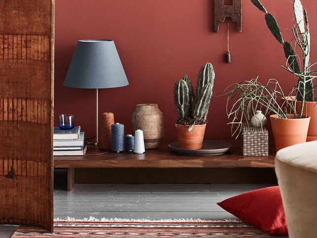
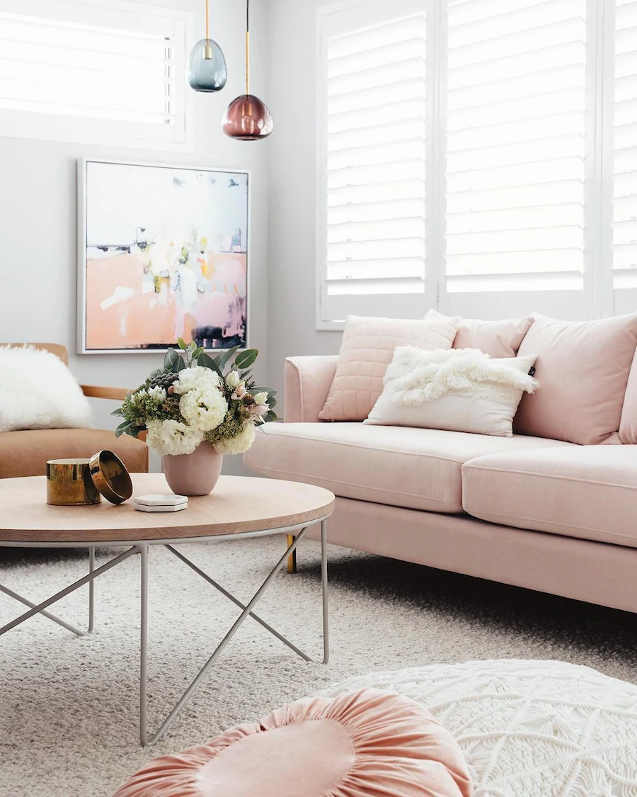
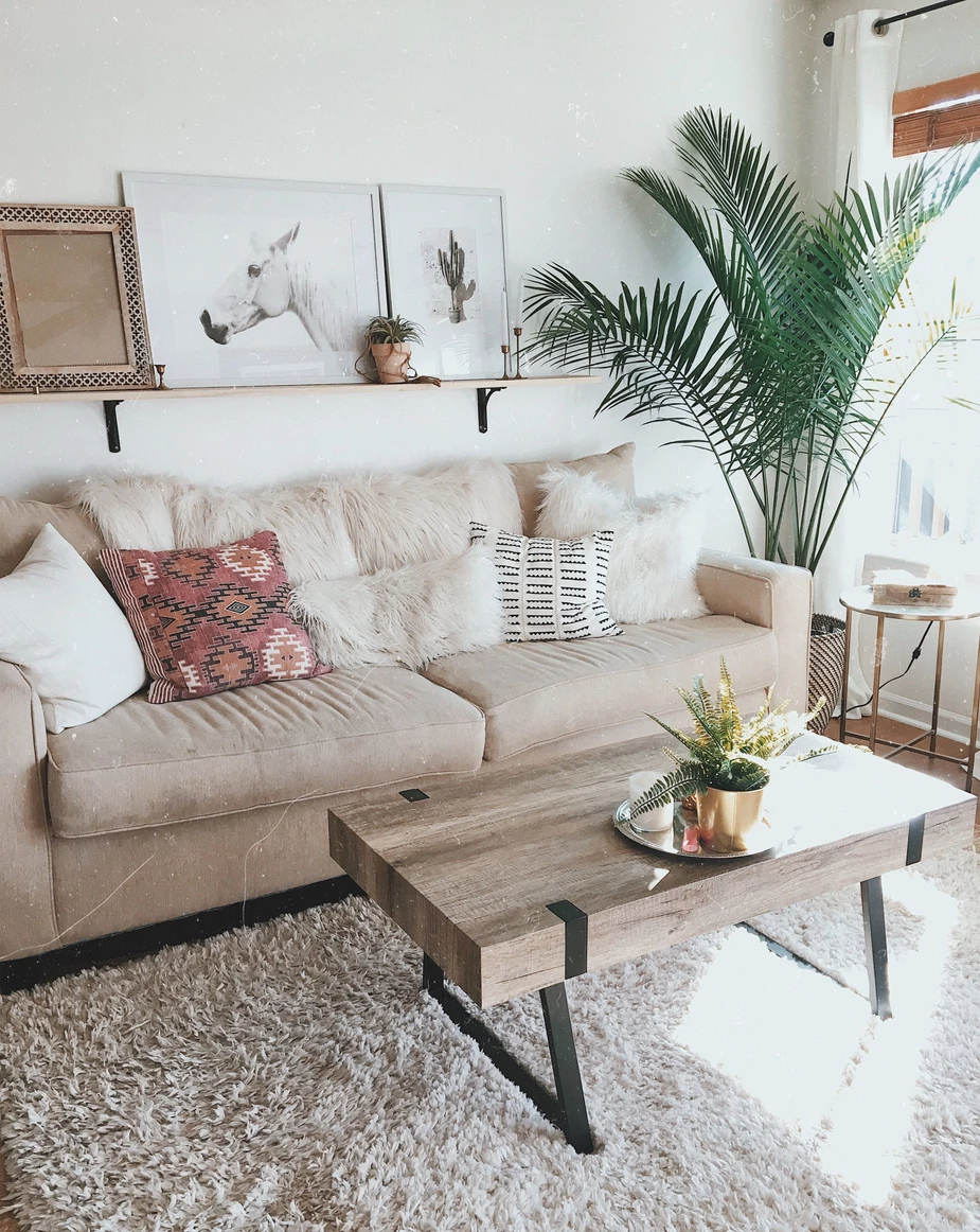
To get to mix the textures this gives life to your decor without weighing it too much it is important to start by selecting a color palette and using it to find a host of items of different contents.
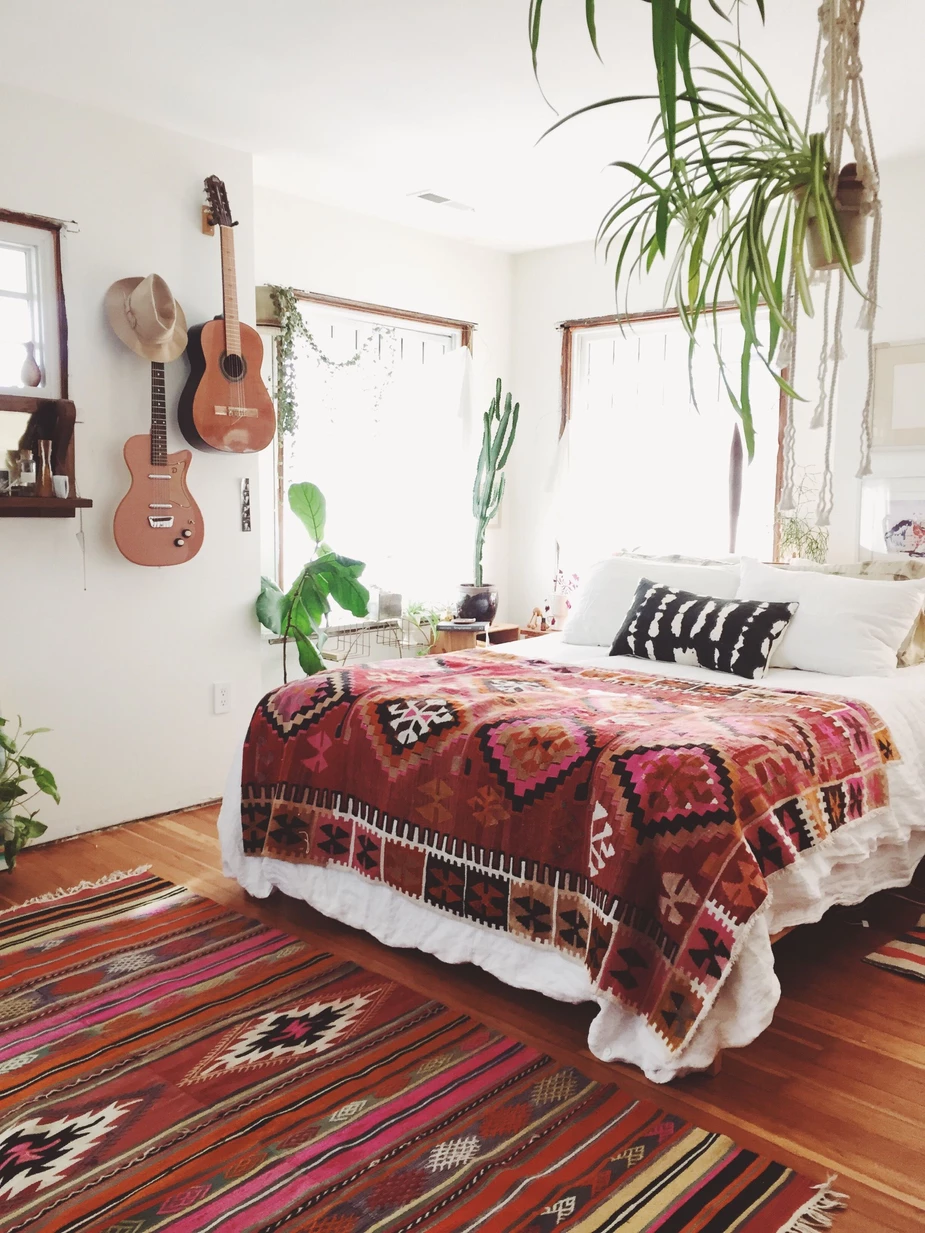
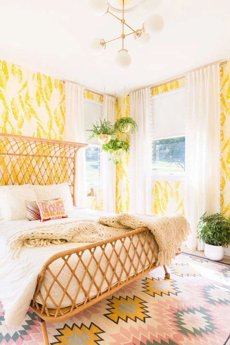
For this assembly of materials to work, it is essential to work with objects and textures of natural origin, that is to say woolens, leather, cotton, linen, self, rattan (with its dazzling return to the world of decoration) and wood. Granted, you may go for options that mimic these materials, but make sure they look like real material.
PS. : Do not forget to add greenery, it will change everything in your decor !!
Mix the patterns without mixing!
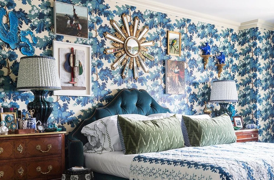
Matching patterns is not always easy. On the one hand, for some it is about breaking established norms and on the other hand, even if this concept allows to break convictions, there are still rules to follow! But what are these rules?
First, either you are working with a range of similar colors (as mentioned in the previous paragraphs), or you are working with contrasting colors.
Already, mixing patterns can seem very daring for some, but when you follow these two basic rules you will know how to do it without disturbing your eyes and those of others too much. When you mix patterns of the same color, it’s easier and the result is just as grand. The tone on tone brings a little dynamism to a sober decor!
When you decide to work with contrasting colors, be careful. You choose only 2 colors and their variations and if you want to be really successful your best to highlight one of these two colors and use the other sparingly! For example, you decide to work with emerald green (wow! This color could be used everywhere!) As the main color, you can place some magenta elements sporadically in your decor!
The last tip to succeed with a decor where you mix the patterns is to work with the volumes and shapes of the patterns! Indeed, if you decide to highlight a huge floral pattern on the main wall of your bedroom, don’t go with a mini flower that is repeated on your duvet cover and a medium-sized pattern on your carpet. Already there is a lot going on for the eye; let him get used to the same size of patterns.
When it comes to the shape of the pattern, remember that they must complement and understand each other. IN? And yes, it is important that each motif succeeds in emphasizing the other; if your main pattern consists of very angular geometric images, don’t pair it with a baroque-style flower with lots of frills! Can you put a geometric image with a floral pattern? Yes! But make sure the flowers are more subdued and don’t have a bunch of arabesques in it, it could be a monochrome floral fabric or even wallpaper with simple flower brushstrokes. This will balance the eye and your decor will be beautiful and dynamic!
All that to tell you to have fun with your little nest! Whether you are more of a mix of natural and monochrome material or that you have a real go for mixing complementary color patterns, let yourself go, there aren’t many rules to follow to get it all done!